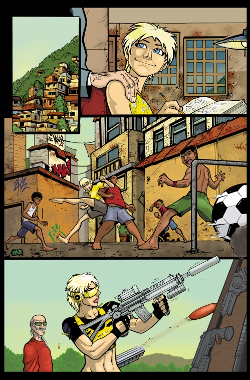
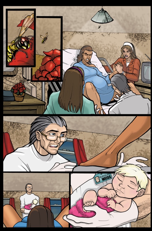
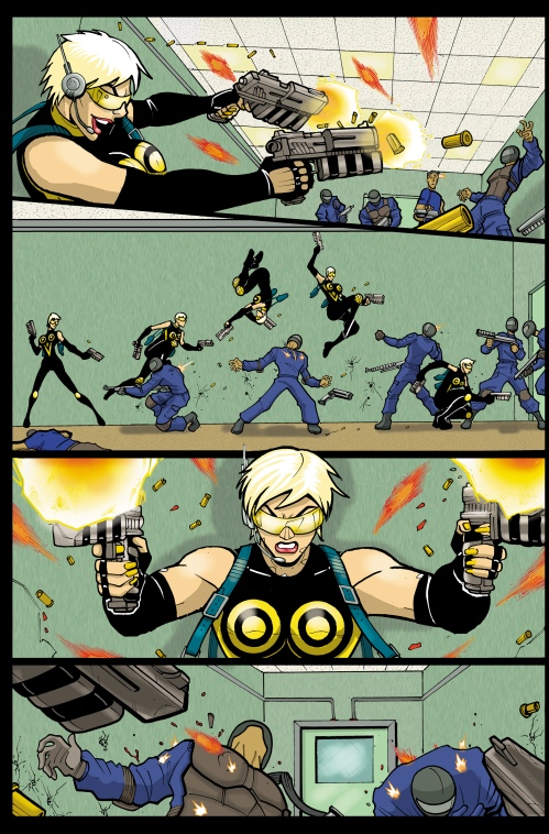
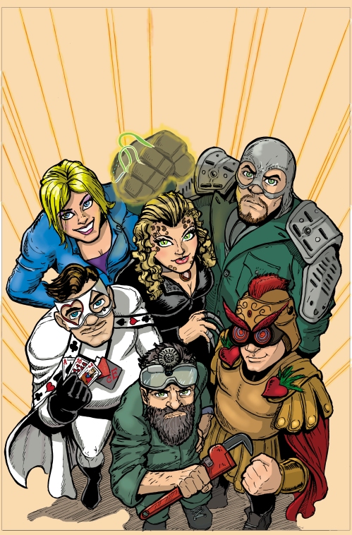
Using photo reference for comic art

Lots of debate, discussion about photo realism, photo references etc. crossing through my Tumblr feed over the last while…  Was thinking about it a lot last night as I was colouring comics pages.

Ty does photo references for his super hero comics (occasionally, believe it or not, we even do them for Simpsons Comics—he’ll announce that yes, they have four fingers, but sometimes he just wants to see how a body would look doing something wacky, then he can go off and draw the Simpsons anatomy). He’s explained many a time to those who don’t understand that photo reference is REFERENCE. To refer to…to look at and say, “Oh! THAT’S what the arm muscles would do in that move.” If you’re tracing it, it ceases to be reference…

It’s not tracing, copying, and he happily tells me all the time, “Sometimes I don’t even use them!” (not understanding that when I’ve taken an hour out of my work day to take photos or pose for them, that might NOT be the thing I want to hear!). And although I try my best to pose him (I’m generally behind the camera) just like his sketches, sometimes what he discovers through the photo reference is that the problem he was having with the drawing is that it wasn’t natural—he was trying to draw the body doing something it just wouldn’t. Or just the opposite:  sometimes what is natural and real just looks wrong or awkward.

What I’m really aware of is the dichotomy between Ty telling me, “Get the pose just like it is in the drawing” and “I don’t need it exact—I need it natural”. Because sometimes the way something looks in life is just…wacky and strange. That if you were looking at a drawing of a pose you’d have a moment where your brain would be trying to decipher why the eyes look like that, doesn’t that nose look strange? Wha—why are the arms all akimbo like that? Or, in real life, there would be a big heavy black shadow across someone’s body—but an artist wouldn’t want to have that lying across a big portion of the art. It wouldn’t “read” right…so it gets altered.

So, sometimes, while I’m posing Ty, he’ll say, “no, no, not ‘real’—let’s cheat it. This is comics, not real life. I’m telling a story here.” And that’s what I notice as I colour someone who is using photo reference for everything—and who is using it not to see muscles or how the hands look, but using it to draw. They’re drawing exactly what they see—and sometimes, what they see doesn’t make sense in a static 2D comic book page. I especially notice it with faces—when Ty was doing the Dexter The Early Cuts animated series, Michael C. Hall looks completely different when he turns his face 1 centimetre to the left or right of dead-centre**. I would look at pictures Ty had drawn and be able to tell him which ones he would be asked to redraw because they didn’t look like Hall (he had final approval on his image). Ty would show me the reference shots he’d been sent, and that he’d compiled himself—and I would be surprised to discover that they were all of the same actor…but you just couldn’t tell. And with photo references that happens a lot—you might be drawing the same person, but from a different angle, it just doesn’t look it to someone not in the room with that person. Whereas, someone not wedded to the photo reference will tweak the drawing so that it looks more like the character—even if it’s not “real” or just like the reference.

(**I’m always amazed by Anna Paquin—straight on, she has an unusual face that one can decide if you think it handsome or plain. But in profile? I think she has the MOST gorgeous profile ever. Something Rossetti would have painted, very pre-Raphaelite)

Toronto ComiCON: the morning after. Ish.

It’s Monday and we’re back in full work mode…hard to do after a busy and wonderful weekend at Toronto ComiCON but that’s what a comics creator has to do in order to get to go to these conventions!

Toronto ComiCON is a renaming of what was the Fan Appreciation Events of previous years, from the same company that produces FanExpo Canada. This year’s event featured more ‘name’ guests than usual. All the comics guests were still gathered together in one area, in rows of tables with those who had paid for their tables clustered in the middle. The ‘name’ guests were all on the far left of each row, so that their fans could line up against the wall and not block the aisles at all. It was a good system–although with the other end of each table being closed off by a booth that meant that all the other artists had to push past that name guest to get out.  I had some fear that my bag would swing off my shoulder and I would thwack Phil Jimenez across the head or knock over Mark Bagley’s standee.  (And I discovered quickly that I’m a lot more claustrophobic than I would have guessed–seeing the hordes blocking the only free end of the table as they waited for Jiminez and George Perez was a bit overwhelming at times).

There were a lot of familiar faces at our table–Gibson Quarter (a frequent collaborator of mine, a former student of Ty’s at TCW, and a collaborator with both of us on the Holmes Incorporated books); David J. Cutler (one of Ty’s former students, the artist on The Northern Guard, and currently working with me on Heroes of the North’s  Nordik:  Chilling Me Softly). On the other side of Ty was the inimitable Leonard Kirk, and then Mr. Phil Jimenez.

Across from us were the Teuton guys for Big Sexy ComicsFearless Fred Kennedy and Adam Gorham. I did pop by to say a quick hello, but they were busy with fans and questions, so I mostly left them be. George Perez was at the end of their table, easily identifiable by the big smile and the amazing shirts (a pattern of M and Ms the first day, and I believe a pattern of toy robots on the Sunday).

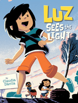
Got to meet and briefly chat with Claudia Davila (writer/artist of the kids book Luz See The Light) at a moment when she wasn’t busy with fans (or her daughter who was there on the Sunday in a wonderful fabric crown of pale purple with a big gold star and a long pink cape). On Sunday, I introduced myself to her husband Michael Cho and got to talk to him for a while. He and Ty had never actually physically met in all the years they’ve both been at Toronto cons so I introduced them. The result was a very energetic and passionate conversation about their favourite years of Jack Kirby’s  creativity (Ty said ’71-’76 stating that most people would prefer the 60s ,  but Michael was in complete agreement until Ty said “The Demon”.  There they parted ways…)

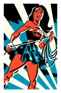
Wonder Woman by Michael Cho--I spent the whole con eying this. I've promised my daughter that I'm getting this for her next con...

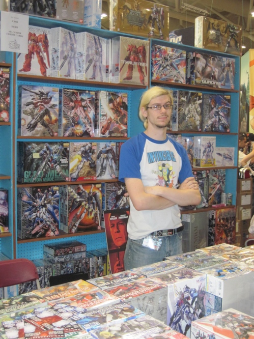
I tried to wander around the con a couple of times but it was BUSY!! (My stories of conventions necessarily end up being pretty myopic as I spend most of my time at the table or wandering to another creator to chat for a while.) I mostly stayed with Ty to chat with people and answer questions for when Ty was too busy, to watch his space or David’s and Gibson’s (nice feeling to sell some of the prints that I’d coloured!)

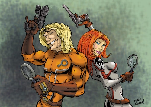
Pencils Gibson Quarter, Inks Guillermo Ortego, Colours Keiren Smith

Ty made a run on Sunday to find Quarter or Dollar comic bins. He came back awed by the impressive pile he’d picked up from a bin of DIME comics. Dime comics!! Usually, he regards Quarter Comics as  The Best Purchase Ever and has reluctantly moved up to Dollar Comics in recent years. When he discovered the Dime Comics, I was stunned that he left any behind.

Over the two days, I waved quick hellos at various creators–but it was so busy with appreciative fans that there wasn’t  a lot of chance for conversations. That was saved for dinner on Saturday night. Local creators Agnes Garbowska and Francis Manapul let Yanick Paquette in on the location of one of their favourite restaurants (a Thai place down on Queen’s Quay) where they were awaiting Marcus To and Marco Rudy, so Yanick showed up with Gibson Quarter, Richard Pace, Phil Jiminez, Paolo Rivera and his partner April, and me and Ty.

We had a great time–lots of good food and, as is always the case after a long day at a con, sharing stories of some of the more interesting sketch requests (okay we’ve all heard about the honey guy, and the glue guy but…camel toe? Really?), battle stories and more. We even had a brief discussion of American politics (that was before we’d met up with the whole group–there were half a dozen of us in a bar awaiting drinks and I can’t remember what Phil Jiminez said but there was this great moment where everyone there realised that Phil had just opened up the conversation to something that would make Ty inordinately happy! Ty, son of a former radio and newsman, loveslovesloves to discuss politics, most particularly American politics. It was an energetic and rowdy fun conversation.)

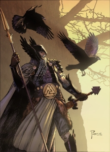
Constant loud admiration has its benefits!! After commenting on Richard Pace's "Classic Mythology Odin" on his deviantART and posting it on Tumblr, Richard gave me a print!!

All in all–exhausting but worthwhile.  It’s always a bit strange for me at conventions–I prefer to let Ty make all the conversation so I have to really try to “put myself out there”. This works well in limited bursts–I’d try to meet a creator and say hello, and if their eyes shifted off to the side for the slightest moment, I’d have a brief panic that I was taking up too much of their time and melt away. On the other hand, I do like to warn people that if you make the mistake of talking to me, I’m likely to talk your ears off–one of the reasons people have trouble believing I’m as shy as I swear I am.

Ty and I still have loads of work to do before we catch up–two days away from our desks is a lot. But Ty made a point of telling me how glad he was that we ignored our deadlines and went out to dinner with everyone.  We were only sorry to have missed out on other opportunities to hang out, but we did have kids waiting for us at home…

Reference Photos

Have to shoot some reference photos for Ty and we’re out of toner for all the printers in the house. Pointed out that he can just look at the reference photos on his monitor which made him complain a lot–which makes me wonder how he ever managed back in The Old Days with those itsy little ol’ Polaroids.  (To be fair, I do know that it’s because that means he’ll have to sit in his computer chair at his desk to draw, rather than lounging in his comfy drawing chair on the other side of the room.)  And how much money we’ve saved with the switch to digital cameras! (Which got balanced out by all those children so…still broke!).

Ty always goes on and on about how good I am at taking all his reference photos–probably because I was always so conscious of how much that damned Polaroid film cost, and that you only got 10 (?) shots in a package. So, we had to make every one count.

And I always preferred shooting the photos to having to ‘star’ in them…I’ve told tales of being four days postpartum and having to sit on the exercise bike in my skivvies pretending to be Wonder Woman riding a kangaroo–seriously–and the baby started crying, so I had him in one arm, and posing the whole time.  The following Batman cover I remember well.  We would look at Ty’s sketches and try to figure out how to get the reference shot in just one photo–because of those pricey Polaroids! Nowadays, it would be three or four pictures. But for that one, I remember having to pile all the sofa cushions in the corner of the sofa and balancing precariously on top of them, head completely over the edge, preparing to topple to the floor at any moment. The Batman and Robin figures would have been so easy–either I would have stood at the top of our very steep stairs shooting down at Ty…or those might have been down with him lying down on the floor reaching out toward me.

I always wonder what the neighbours would have thought if they could have seen any of what we got up to for these shots…)

(I’ve Googled and Googled, and I can’t find Ty’s pinup of Wonder Woman riding a kangaroo…wish I could remember what it was for…  It would have been done in February 1996, so it would have been published probably that summer).

Working…

It’s been a long strange summer (after a long strange spring and a long…blah blah blah) but Fan Expo Canada is this weekend which must mean it’s coming to an end! For our family, Fan Expo has always been the “official” sign that summer vacation is over and that school is around the corner. Ty would always take the eldest boy living in our house on the Friday who would ‘suss out’ the show for the younger kids (used to be Kellam, but he ended up working the show for years whilst an employee of The Silver Snail. Despite quitting the store, he’s actually helping them set up today, and will be at the booth tomorrow and Sunday).

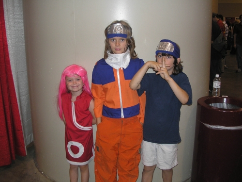
Sunday we’d take the whole family and let the kids check everything out, usually in some costumes they’d insisted I put together THE NIGHT BEFORE…

This year, I’m going to be at the show myself for the whole four days with my own little table as well. Probably my table will end up with Ty’s art on it (given that I flat/colour/letter lots of his stuff that still counts), but there I will be. I’m sitting at PO56B, between David J. Cutler and Mr. Keiren Smith, as part of The Northern Guard art team.

Issue 2, page 9

Ty will be running a couple of workshops for the show. On Thursday, 5-6pm, he’ll be heading up Make Your Own Comic:  Assembling Holmes Incorporated #2, along with some of the creators, and assisstant editor Rob Pincombe. Toronto Cartoonists Workshop has a booth in the lobby area of FanExpo where you’ll be able to buy copies of the comic and meet creators.

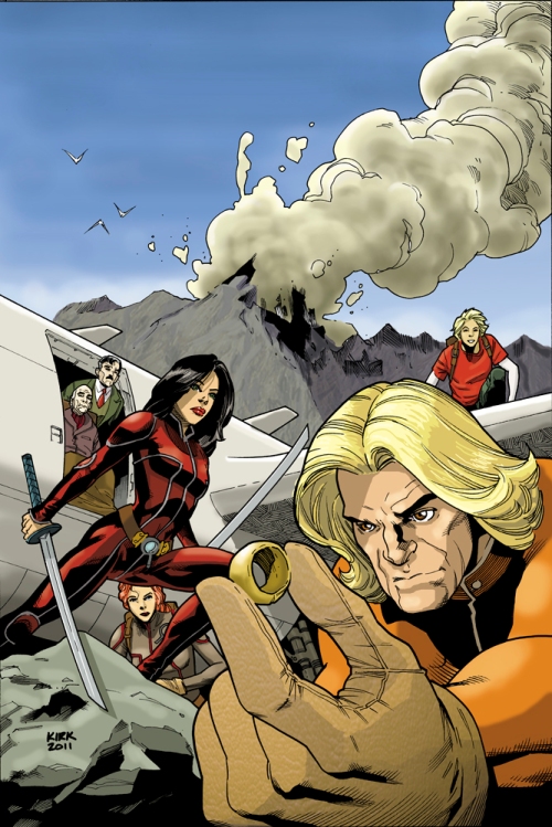
Art by Leonard Kirk, colours by me, Concept/characters by Ty Templeton

On Saturday from 12-1pm, Ty will run Ty Templeton’s Comic Book Bootcamp to give people just a hint of what it’s like to take the full course with Ty. (courses available through TCW–the workshop will run Mondays or Tuesdays beginning September 12, but spaces are going fast).

Later that day, 4-5pm, Ty and his buddy Dan Slott will run Superhero Stew:  Create a Character with audience input. All the workshops will be in Room 717.

I’ll be walking in the room at 6pm to moderate Watercolour Masterclass with Jill Thompson. Not that Ms. Thompson will need any help from me–I’ll be there to help her field questions from the audience and maybe ask a few of my own.

On Sunday, from 4-5pm, I’ll be moderating a Painting Workshop with Jason Edmiston, (cover artist for The Northern Guard amongst many other things).

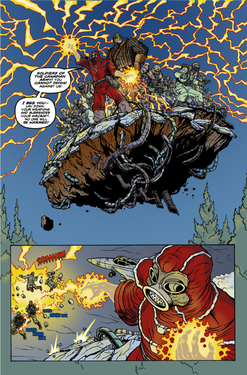
Heroes of the North, the Canadian superheroes webseries for whom I’ve lettered comics (and coloured their latest Hornet:  Dark Origins) will be in Booth 211. They will also be having a Meet and Greet on Friday, Room 713, from 4:30pm.

Story by Yann Brouillette, Art by MAS, colours/letters by me

And…Tights and Fights, the comedy Canadian superhero webseries will be there as well, in Booth 1000. At some point during the weekend, you might find me there…their webcomic is available online now.

Art by Christopher Yao, Story by Rob Pincombe, colours/letters by me

So…hope to see you there.

Keiren

Heroes of the North–Hornet: Dark Origins

Just finished up some work for the Heroes of the North. I’ve done lettering for them before, but this is the first time I’ve coloured…wildly intimidating following MAS colouring his work as he has an incredibly distinctive and amazing style, so I just went off in my own direction. Click through and give it a read, and make sure you check out the whole site–it’s amazing what this production company has managed to do with their own money to make this webseries and webcomic series.

Art by MAS, story by Yann Brouillette, colours/letters by me


The Tights and Fights: Ashes

Wow–it’s been a while, I’d almost forgot this book! More of a mini-book (I think 13 pages?). I coloured and lettered this for the webseries Tights and Fights…and now it’s available on their homepage! Art by Christopher Yao, script by Robert Pincombe. Click through and check it out:

The Tights and Fights:  Ashes comic book


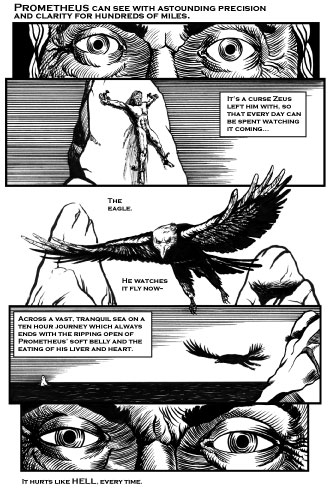
Prometheus Bun Toons

Normally, I try and promote The Guy’s weekend ‘Toons when I can (especially if it can be self-serving and promote me as well)…but I was a bit hamstrung yesterday as he asked me not to mention N*** or Sp*** or the Sp*** Sh*****…but it seems people have been able to find it, and read it.

Check out the artwork by Jason Laudadio which is incredible. And somehow, I neglected to add my lettering credit. I think I thought it threw off the balance of the the title and the names. Sometimes it just isn’t about me!

Click on the first page to read the full story over at ART LAND!!

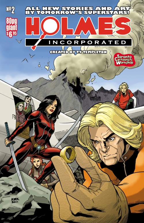
Holmes Incorporated #2 OUT TOMORROW!!

All the work I’ve been doing the last few weeks is going to pay off soon–for you, the reader! Tomorrow night is the official Launch Party for the new studio location of Toronto Cartoonists Workshop, and for the second issue of Holmes Incorporated.  The print issue will be available for purchase at the school tomorrow, and we’ll be announcing soon it’s availability on digital comic book download sites.

As always, check out the Holmes Incorporated website–the creators have all participated by writing tutorials based on what they used/learned working on their stories. And all the creator bios are available there with links to their own sites if you want to see more of their work.

Pencils and Inks by Leonard Kirk, colours by me

I lettered all 76 pages of art…and did the production on the whole darned issue so all the glorious mistakes can be blamed on me and me alone; none of that hunting around for who all screwed up (it’s been a long morning of file-fixes and glitches–can you tell?).

So…mark Friday on your calendar, and sit by your computer awaiting word!

The Family Name by James Cooper and Daniel Wong

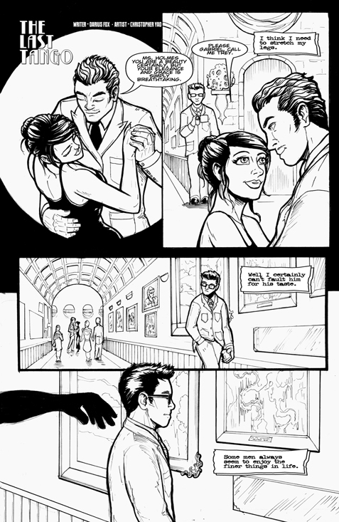
The Last Tango by Darius Fox and Christopher Yao

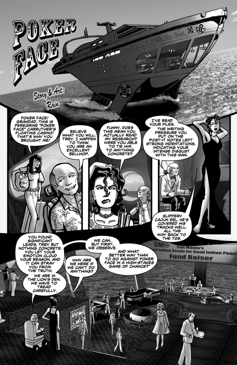
Poker Face by Rain Infinity

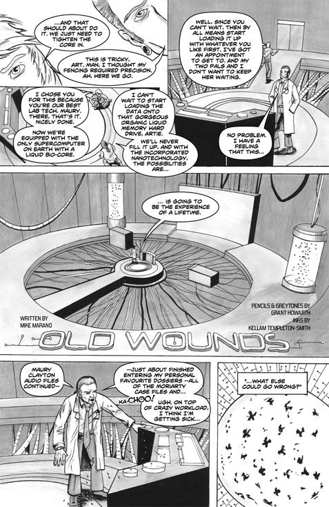
Old Wounds by Mike Marano, Grant Howarth and Kellam Templeton-Smith

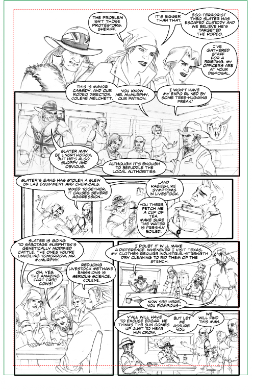
Eight Seconds to Mayhem by Kathleen Gallagher and Danny Setna

Polarized by Sam Ruano and Gibson Quarter

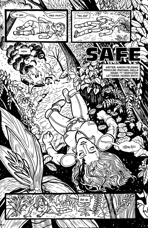
Safe by Aaron Feldman, Rachael Wells and Ty Templeton

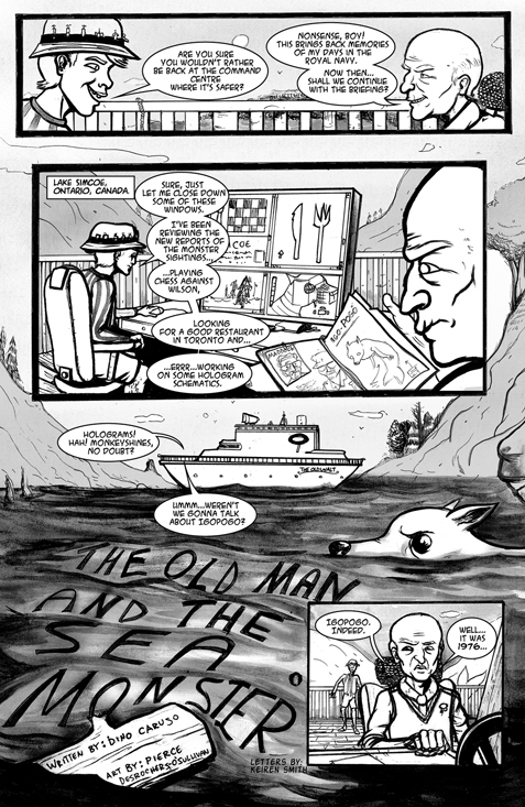
The Old Man and the Sea Monster by Dino Caruso and Pierce Desrochers-O'Sullivan

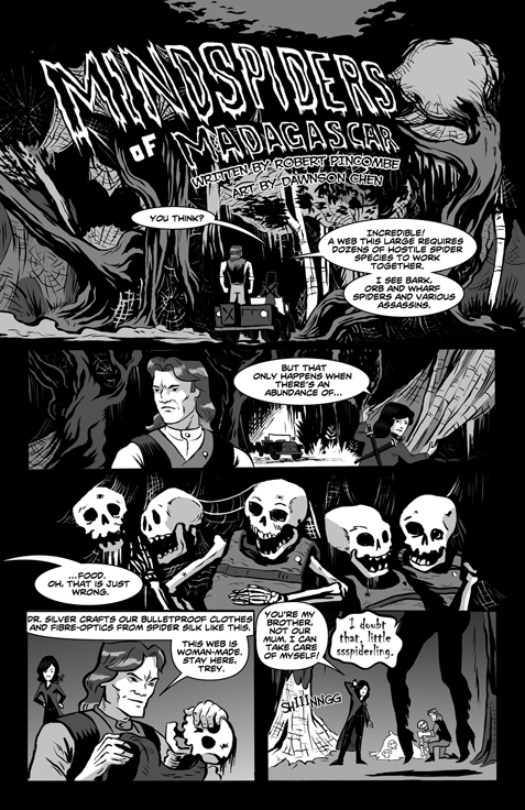
Mind Spiders of Madagascar by Robert Pincombe and Dawnson Chen

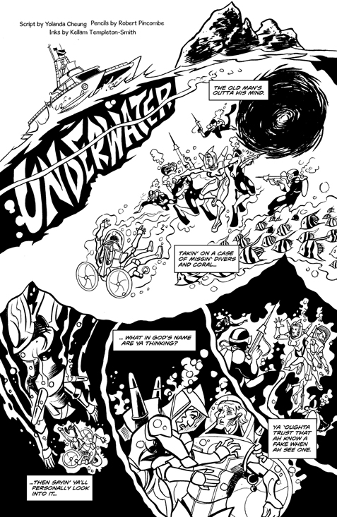
Underwater by Yolanda Cheung, Robert Pincombe and Kellam Templeton-Smith

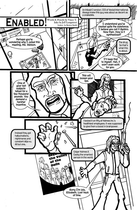
Enabled by Vince T., inks by Jeff Longstreet

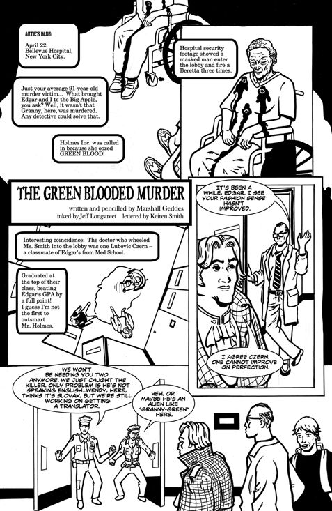
The Green-Blooded Murder by Marshall Geddes, inks by Jeff Longstreet

Holmes Incorporated #2 pinup

by the One the Only Gibson Quarter. Haven’t had a chance to work with Gibson in a while, so this was a lot of fun. Bit disappointed though–I’d made a point of trying to bump up my colours and sex them up a bit and while I was happy when I was finished, now that I’m seeing it “out and about” on the ‘net, it’s not quite the same. So, I may have to go in and see what I can do (when I have some free time, of course).

Holmes Inc. #2–starting production

The editor has approved all the lettering I’ve done for Holmes Inc. #2 (so nice when he lives in the same house–he says “fix this” and I fix it, and it’s good to go in seconds).  So, I’ll be working like mad for the next two days to get it off to the printer’s for tomorrow afternoon.

"Eight Seconds to Mayhem" written by Kathleen Gallagher, drawn by Danny Setna, lettered by Keiren Smith